Heuristic evaluation is a usability inspection method in which a small group of evaluators independently examine a user interface and judge its compliance with a short list of recognized usability principles, or heuristics. Introduced by Molich and Nielsen (1990) and refined by Nielsen (1994), the method was designed as a "discount usability engineering" technique: fast, inexpensive, and easy to learn, making systematic usability assessment accessible even to teams without a dedicated usability laboratory. Each evaluator works alone, stepping through the interface at least twice while noting every element that violates any heuristic, and the individual findings are then aggregated into a single list of usability problems.
Despite its simplicity, heuristic evaluation has been shown to find a substantial proportion of usability problems — often more than informal walkthroughs and sometimes comparable to empirical user testing, though the two approaches tend to uncover different kinds of issues (Jeffries, Miller, Wharton, & Uyeda, 1991). The method rests on the cognitive-psychology insight that well-chosen general principles can serve as a proxy for the many specific usability guidelines a designer would otherwise need to memorize: rather than consulting hundreds of rules, an evaluator can hold ten heuristics in mind and recognize violations as they arise. Because no end users are required, heuristic evaluation is especially useful early in the design cycle, when prototypes are rough and recruiting participants would be premature.
The Usability Heuristics
Nielsen's original set of nine heuristics (Molich & Nielsen, 1990) was revised and expanded to ten after a factor analysis of 249 usability problems against multiple heuristic sets (Nielsen, 1994). The refined set has become the most widely used in practice.
- Visibility of system status. The system should always keep users informed about what is going on, through appropriate feedback within reasonable time.
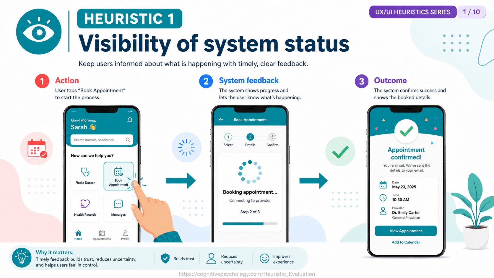
Problem: When Sarah taps "Book Appointment," the app contacts the provider's scheduling system but shows no response, leaving her unsure whether the tap registered — so she taps again and risks starting a second booking.
Correction: Acknowledge the action immediately with a progress indicator ("Booking appointment… connecting to provider, step 2 of 3"), then a clear "Appointment confirmed!" screen listing the date, time, and provider, so she always knows the system's state.
- Match between system and the real world. The system should speak the users' language, with words, phrases, and concepts familiar to the user, rather than system-oriented terms.
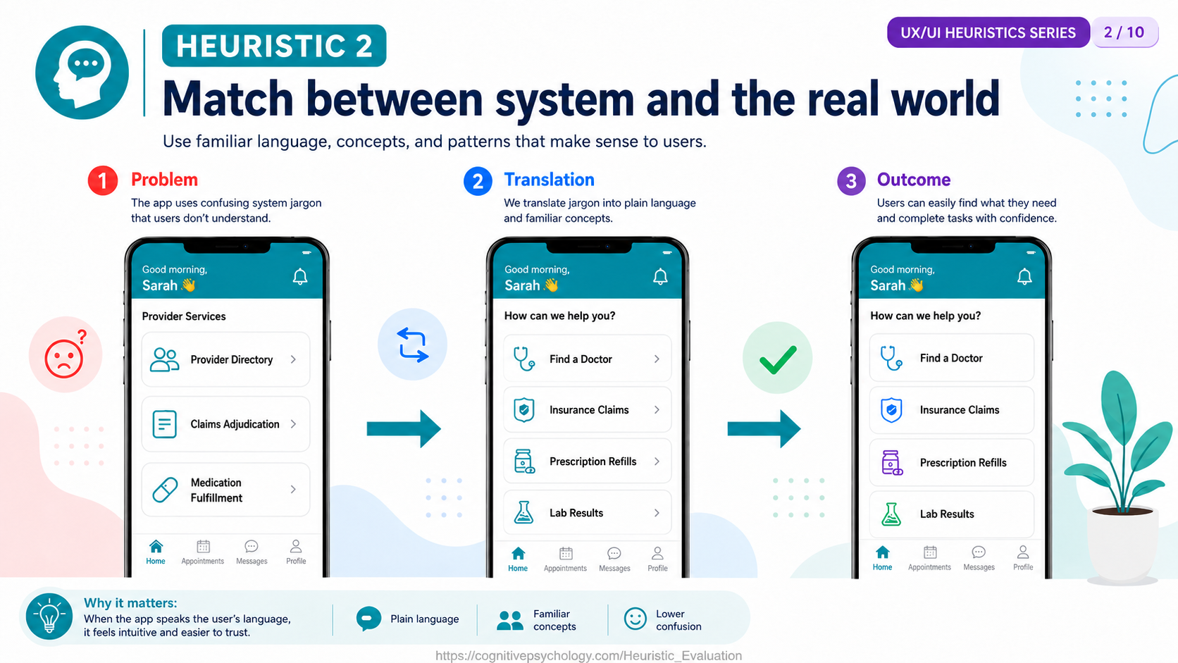
Problem: The home screen uses back-end terminology — "Provider Directory," "Claims Adjudication," "Medication Fulfillment" — that Sarah has to decode before she can act.
Correction: Relabel each option in everyday language: "Find a Doctor," "Insurance Claims," "Prescription Refills," and "Lab Results," so the menu reads the way a patient thinks about their care.
- User control and freedom. Users often choose system functions by mistake and need a clearly marked "emergency exit" to leave the unwanted state without having to go through an extended dialogue.
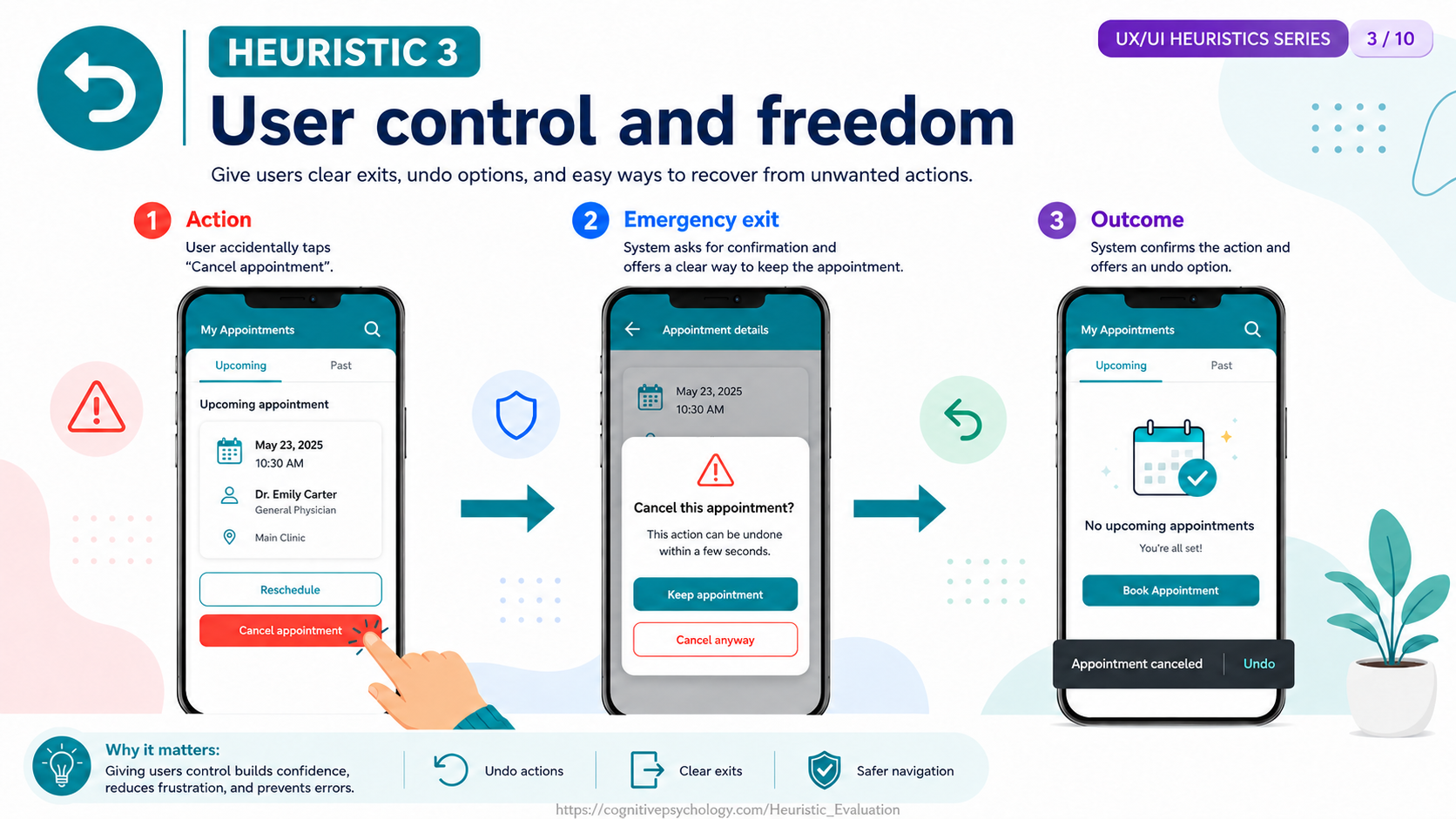
Problem: Sarah accidentally taps "Cancel appointment," and if it executed instantly it would erase a booking she meant to keep, with no way to get it back.
Correction: Offer an emergency exit and a reversal — a "Cancel this appointment?" confirmation with a "Keep appointment" option, and, if she proceeds, an "Appointment canceled — Undo" message that restores it within seconds.
- Consistency and standards. Users should not have to wonder whether different words, situations, or actions mean the same thing. Follow platform conventions.
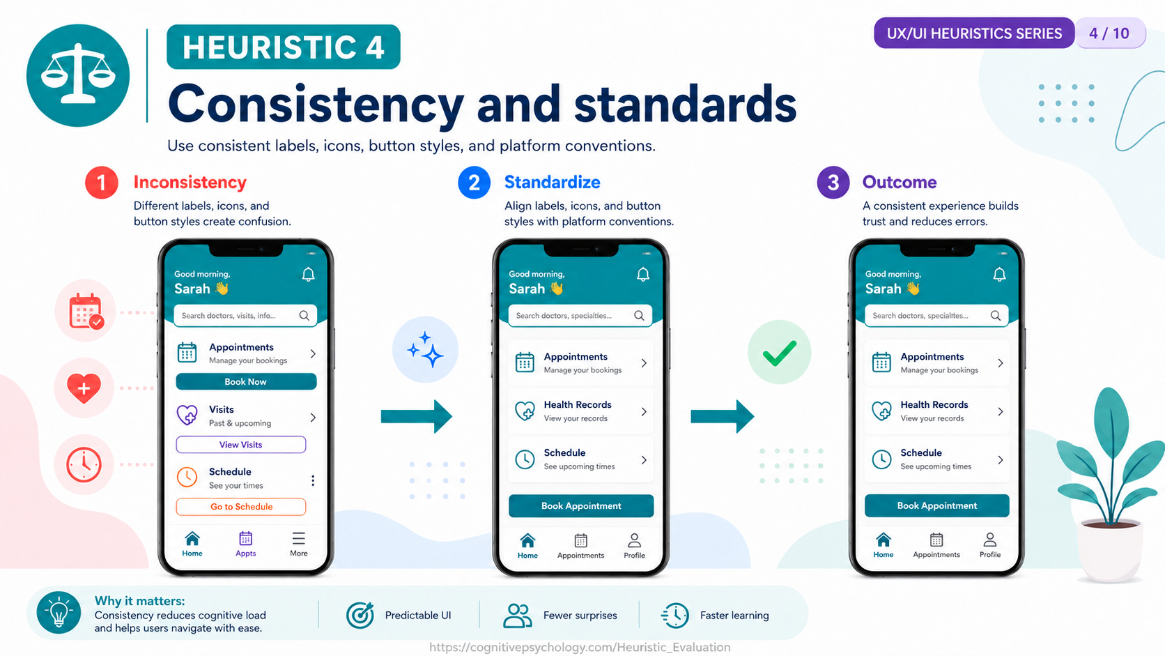
Problem: The same kind of action appears under different names and styles across screens — "Book Now," "View Visits," "Go to Schedule" — so Sarah can't tell whether they're the same feature or different ones.
Correction: Standardize the wording, icons, and button styles on a single "Book Appointment" action used consistently, so a control learned in one place behaves predictably everywhere.
- Error prevention. Even better than good error messages is a careful design that prevents a problem from occurring in the first place.
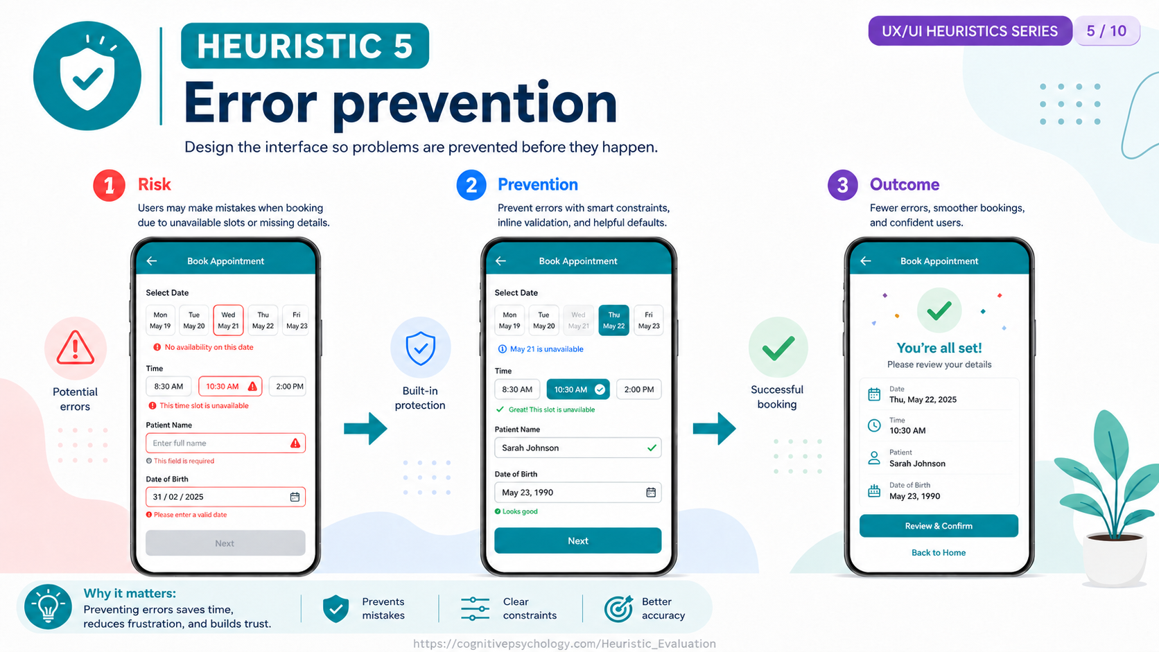
Problem: The booking form lets Sarah pick an unavailable time slot, leave the required name field blank, and enter an impossible date of birth like "31/02/2025," surfacing all the failures only after she submits.
Correction: Build in guardrails before submission — disable and mark unavailable slots, confirm valid entries inline, prompt for the required name, and validate the date of birth as it's typed — so the form steers her toward a valid booking.
- Recognition rather than recall. Minimize the user's memory load by making objects, actions, and options visible. The user should not have to remember information from one part of the dialogue to another.
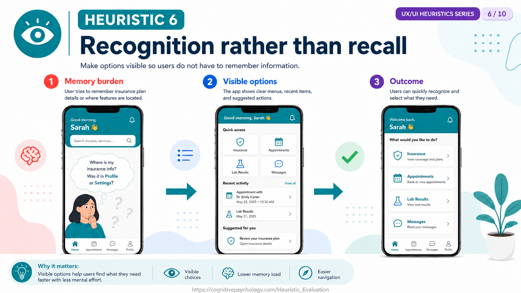
Problem: Features are buried in nested menus, leaving Sarah to remember where things live ("Is my insurance info under Profile, or Settings?") instead of seeing them.
Correction: Make the options visible so she can recognize rather than recall them — a "Quick access" grid, a "Recent activity" list, and a "Suggested for you" prompt — putting the choices on screen rather than in her head.
- Flexibility and efficiency of use. Accelerators — unseen by the novice user — may speed up the interaction for the expert user, so that the system can cater to both inexperienced and experienced users.
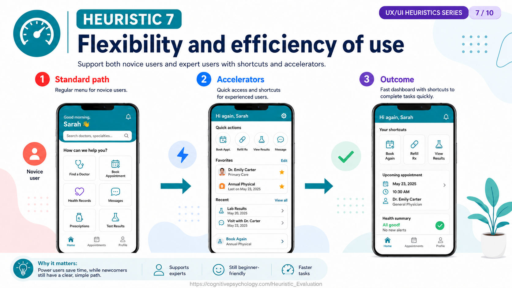
Problem: A returning patient who books with the same physician every month is slowed down by having to walk through every step of the full guided menu each time.
Correction: Layer accelerators on top of the standard path without removing it — a "Quick actions" row, a "Favorites" list with Dr. Emily Carter pinned, and a "Book Again" shortcut — so experts move fast while novices keep the simple menu.
- Aesthetic and minimalist design. Dialogues should not contain information that is irrelevant or rarely needed. Every extra unit of information competes with the relevant units and diminishes their relative visibility.
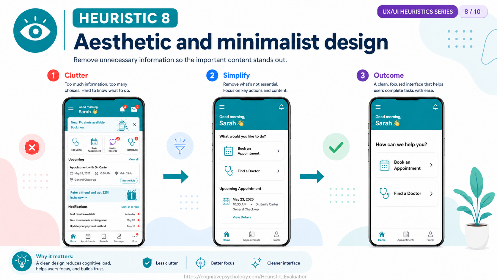
Problem: The home screen shows everything at once — notification badges, a flu-shot banner, a "Refer a friend and get $25!" card, and a list of alerts — until the task Sarah came to do is lost in the noise.
Correction: Strip the screen to its essentials, giving the primary actions (Book an Appointment, Find a Doctor) prominence and moving secondary content out of the way, so the important content stands out.
- Help users recognize, diagnose, and recover from errors. Error messages should be expressed in plain language (no codes), precisely indicate the problem, and constructively suggest a solution.
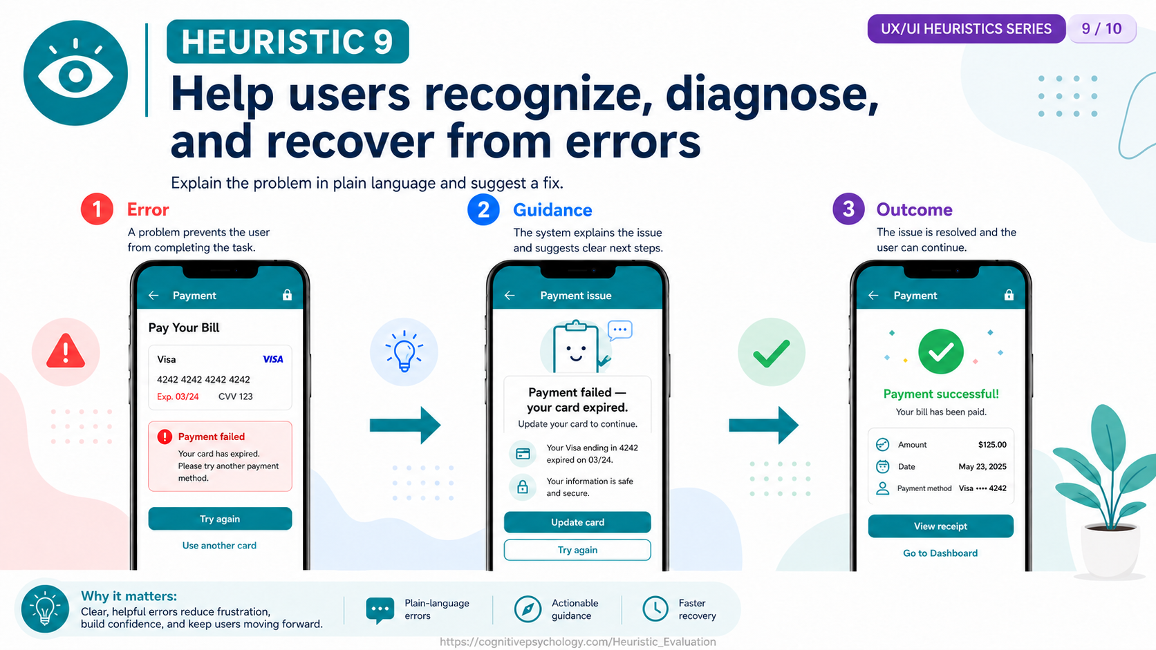
Problem: When Sarah's payment fails, a generic "Payment failed. Please try another payment method" tells her something broke but not what or why.
Correction: Rewrite it in plain language that names the cause and the next step — "Payment failed — your card expired. Your Visa ending in 4242 expired on 03/24" — reassure her that her information is secure, and offer an "Update card" button that leads to a "Payment successful" confirmation.
- Help and documentation. Even though it is better if the system can be used without documentation, it may be necessary to provide help and documentation. Any such information should be easy to search, focused on the user's task, and list concrete steps.
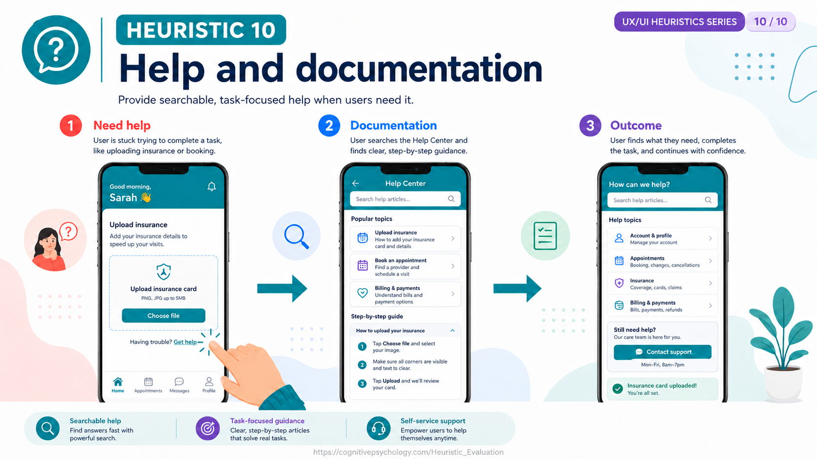
Problem: Trying to upload her insurance card, Sarah gets stuck because the requirements aren't obvious and there's no help at the point of need.
Correction: Provide searchable, task-focused help — a "Get help" link beside the upload control opening a Help Center with a step-by-step "How to upload your insurance" guide (choose the file, make sure all corners are visible and text is clear, then upload) and a path to contact support.
How a Heuristic Evaluation Is Conducted
A heuristic evaluation unfolds in three phases (Nielsen & Mack, 1994):
- Briefing. Evaluators are given background on the product, its target users, and the domain. If the interface requires domain knowledge (e.g., a medical records system), the briefing includes enough context for evaluators to judge the design meaningfully.
- Individual evaluation. Each evaluator inspects the interface alone, stepping through it at least twice — once to gain an overall feel, once to focus on specific elements — and recording every instance where the design violates a heuristic. Each problem is linked to the specific heuristic or heuristics it violates and rated for severity.
- Debriefing. The evaluators meet (or their individual reports are merged by the study organizer) to produce a consolidated list of unique usability problems, discuss false positives, and prioritize fixes.
Independence is critical: evaluators must not communicate during the individual-evaluation phase, because their findings are biased by social influence if they do. The debriefing session happens only after all individual inspections are complete.
How Many Evaluators Are Needed
Nielsen and Landauer (1993) modeled the relationship between the number of evaluators and the proportion of usability problems found. Their analysis showed that a single evaluator typically finds about 35% of the problems in an interface, and that the curve of cumulative detection follows a diminishing-returns pattern well described by a Poisson model. The practical recommendation that emerged — widely cited as the "magic number" — is that three to five evaluators are sufficient to find roughly 75% of usability problems, offering the best cost–benefit ratio. Adding more evaluators beyond five yields progressively fewer new findings per additional person.
This finding shaped how heuristic evaluation is deployed in industry: rather than assembling large panels, teams use a small set of evaluators and iterate, conducting a second round after the most severe problems have been fixed.
Cognitive Basis
Heuristic evaluation draws on several principles studied in cognitive psychology:
- Recognition over recall. Heuristic 6 is a direct application of the cognitive finding that recognition is easier than recall: people can identify previously encountered information more readily than they can retrieve it from memory without cues. Interfaces that rely on recall (e.g., command-line syntax) impose a heavier cognitive load than those that present options for recognition (e.g., menus).
- Mental models. Heuristic 2 (match between system and the real world) reflects the importance of mental models: when the system's conceptual model aligns with the user's existing mental model of the domain, learning is faster and errors are fewer.
- Working memory limits. Several heuristics (visibility of system status, consistency, recognition rather than recall) reduce the demands on working memory by keeping relevant information visible and behavior predictable.
- Error and slip research. Heuristics 3, 5, and 9 (user control, error prevention, error recovery) draw on human-error research showing that slips and mistakes are inevitable and that good design anticipates them rather than punishing users for making them.
Applications in UX and Information Architecture
In UX and UI design, heuristic evaluation is one of the most commonly used inspection methods. It is applied to evaluate websites, mobile applications, enterprise software, and specialized systems ranging from medical devices to aviation displays. Because it does not require end users, it is particularly valuable in the early stages of design when only wireframes or low-fidelity prototypes exist.
Heuristic evaluation is often used alongside other methods described on the UX/UI page. It complements empirical user testing: the inspection catches many surface-level and consistency problems quickly, freeing user-testing sessions to focus on deeper task-flow and comprehension issues. It also pairs well with card sorting and tree testing, which evaluate information architecture, whereas heuristic evaluation covers the broader interaction design.
Strengths and Limitations
- Fast and inexpensive. A heuristic evaluation can be completed in hours rather than the days or weeks required for full user testing, making it practical for tight schedules and limited budgets (Nielsen, 1992).
- No users required. The method can be applied to early prototypes, specifications, or even competitor products without recruiting participants.
- Broad coverage. Three to five evaluators typically find 75% of usability problems (Nielsen & Landauer, 1993).
- The evaluator effect. Different evaluators often find markedly different sets of problems, and agreement between evaluators can be low — a phenomenon Hertzum and Jacobsen (2001) called the "evaluator effect." This means results depend heavily on who the evaluators are.
- False positives. Evaluators may flag issues that do not actually cause problems for real users, particularly when they lack domain expertise (Cockton & Woolrych, 2001).
- Not a substitute for user testing. Heuristic evaluation tends to find different problems than user testing; neither method alone provides complete coverage (Jeffries et al., 1991).
Key Researchers
The following researchers have made foundational contributions to heuristic evaluation as a usability method, ordered alphabetically by surname.
- Gilbert Cockton — Emeritus Professor of Computer Science, University of Sunderland (and Emeritus Professor of Design, Northumbria University); critiqued the validity and reliability of heuristic evaluation, showing how evaluators' interpretations of heuristics can lead to false positives and missed real problems (Cockton & Woolrych, 2001).
Google Scholar · University of Sunderland - Morten Hertzum — Professor of digital technologies and welfare, Roskilde University; identified the evaluator effect — the finding that different evaluators discover substantially different sets of usability problems — which challenged assumptions about the reliability of inspection methods (Hertzum & Jacobsen, 2001).
Google Scholar · Roskilde University - Robin Jeffries — Researcher, Hewlett-Packard Laboratories; conducted one of the earliest empirical comparisons of usability evaluation methods, establishing that heuristic evaluation, cognitive walkthroughs, guidelines review, and user testing each find different categories of problems (Jeffries et al., 1991).
dblp - Thomas K. Landauer (1932–2014) — Professor of Psychology, University of Colorado Boulder; co-developed the mathematical model predicting how many evaluators are needed to find a given proportion of usability problems, establishing the widely cited three-to-five evaluator guideline (Nielsen & Landauer, 1993).
- Rolf Molich — Founder, DialogDesign, Denmark; co-inventor of heuristic evaluation with Nielsen, producing the original 1990 paper that introduced the method and its initial set of heuristics (Molich & Nielsen, 1990).
Google Scholar · DialogDesign - Jakob Nielsen — Co-founder, Nielsen Norman Group; principal developer of heuristic evaluation, refined the heuristic set from nine to ten through empirical analysis, modeled the evaluator-count curve, and established heuristic evaluation as a cornerstone of discount usability engineering (Molich & Nielsen, 1990; Nielsen, 1992; Nielsen, 1994; Nielsen & Landauer, 1993).
Google Scholar · Nielsen Norman Group
References
| 1 | Cockton, G., & Woolrych, A. (2001). Understanding inspection methods: Lessons from an assessment of heuristic evaluation. In A. Blandford, J. Vanderdonckt, & P. Gray (Eds.), People and Computers XV — Interaction without Frontiers (pp. 171–191). Springer. https://doi.org/10.1007/978-1-4471-0353-0_11 |
| 2 | Hertzum, M., & Jacobsen, N. E. (2001). The evaluator effect: A chilling fact about usability evaluation methods. International Journal of Human-Computer Interaction, 13(4), 421–443. https://doi.org/10.1207/S15327590IJHC1304_05 |
| 3 | Jeffries, R., Miller, J. R., Wharton, C., & Uyeda, K. (1991). User interface evaluation in the real world: A comparison of four techniques. Proceedings of the SIGCHI Conference on Human Factors in Computing Systems (CHI '91), 119–124. https://doi.org/10.1145/108844.108862 |
| 4 | Molich, R., & Nielsen, J. (1990). Improving a human-computer dialogue. Communications of the ACM, 33(3), 338–348. https://doi.org/10.1145/77481.77486 |
| 5 | Nielsen, J. (1992). Finding usability problems through heuristic evaluation. Proceedings of the SIGCHI Conference on Human Factors in Computing Systems (CHI '92), 373–380. https://doi.org/10.1145/142750.142834 |
| 6 | Nielsen, J. (1994). Enhancing the explanatory power of usability heuristics. Proceedings of the SIGCHI Conference on Human Factors in Computing Systems (CHI '94), 152–158. https://doi.org/10.1145/191666.191729 |
| 7 | Nielsen, J., & Landauer, T. K. (1993). A mathematical model of the finding of usability problems. Proceedings of the INTERACT '93 and CHI '93 Conference on Human Factors in Computing Systems (CHI '93), 206–213. https://doi.org/10.1145/169059.169166 |
| 8 | Nielsen, J., & Mack, R. L. (Eds.). (1994). Usability Inspection Methods. John Wiley & Sons. |